


Go Signage Guide for South African Businesses
Go signage is any sign that tells people they may proceed, whether that is a green "go" light, a "proceed" arrow, an entrance marker or a directional sign guiding vehicles and pedestrians through a site. For South African businesses, it sits at the heart of safe traffic flow, clear customer journeys and consistent branding, and it works best when it is designed, made and installed as one coordinated system.
This guide explains what go signage covers, where it is used, which materials and formats suit local conditions, what the rules require and how to plan a project from first brief to final installation.
What does go signage mean?
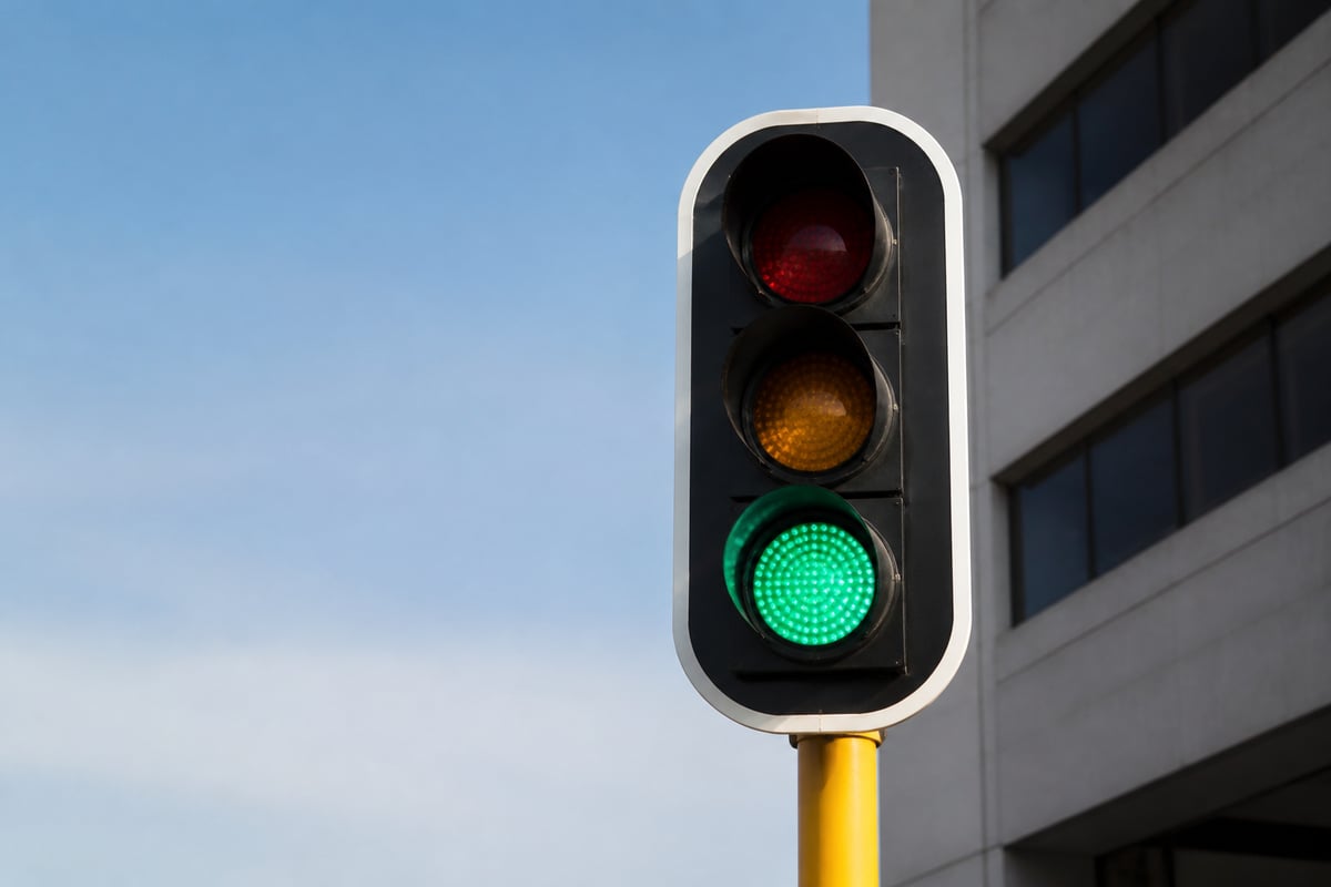
Go signage refers to signs that communicate permission to move forward, in contrast to stop, warning or prohibition signs. The message may be a single word such as "Go" or "Proceed", a green indicator, an arrow, or a combination of colour, symbol and text that tells a person or driver that the way ahead is clear.
In practice, the term covers several related sign families:
- Traffic control signs and signals at loading bays, boom gates, weighbridges and internal roads
- Directional and wayfinding signs that point visitors towards reception, entrances, exits and departments
- Entrance and access signs that confirm where customers, staff or deliveries may enter
- Status indicators such as green-light systems on queuing, parking or bay-allocation setups
Colour carries much of the meaning. Green is widely read as permission or safe passage, which is why it appears in safety and traffic conventions across industries. A go sign works best when it is paired with a clear opposite, such as a red stop or "no entry" sign, so that nobody has to guess which instruction applies.
Where South African businesses use go signage
Go signage is used wherever movement needs to be controlled, guided or encouraged, and each industry applies it differently.
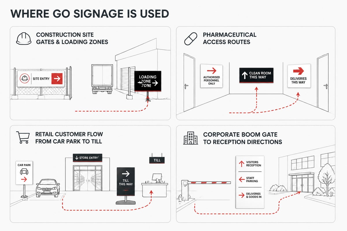
Construction and industrial sites
On a building site, vehicles, plant and pedestrians share limited space. Go and proceed signs at site entrances, gate lanes and loading zones tell drivers when it is safe to enter, while matching stop signs hold traffic when machinery is operating. Facility and construction managers also pair these with pedestrian routes so workers are not walking through vehicle lanes.
Pharmaceutical and clean facilities
Controlled-access areas depend on clear signage that separates entry and exit routes and indicates which doors are cleared for use. Directional and access-status signs reduce hesitation in corridors, gowning areas and goods-in bays, where mistakes carry compliance consequences.
Retail and shopping environments
Retailers use entrance markers, "enter here" signs, queue-direction signs and customer-flow arrows to move shoppers smoothly from car park to till. Well-placed go signage also supports promotions and events, where temporary routes need to be obvious without staff standing at every junction.
Corporate premises
Office parks and head offices rely on directional signage from the boom gate to reception, including visitor parking and delivery entrances. Consistent design here also reinforces the brand, a point covered in more depth in this guide to corporate signage and branding.
Which formats and materials suit go signage?
The right format depends on viewing distance, lighting, weather exposure and how long the sign needs to last. Choosing by use rather than by price alone avoids early replacement.
| Format | Typical use | Key consideration |
|---|---|---|
| Pylon and totem signs | Site entrances, shopping centres, business parks | Visible from the road and at speed |
| Fabricated metal signs | Gates, loading bays, perimeter fencing | Durable outdoors and resistant to impact |
| Laser-cut and 3D lettering | Reception areas, building facades | Strong visual impact and brand consistency |
| Printed boards and panels | Temporary site routes, events, internal corridors | Easy to update or relocate |
| LED and illuminated signs | Entrances used at night or in low light | Visibility after dark and in poor weather |
Material choice matters as much as format. Aluminium resists corrosion and keeps weight down, stainless steel suits harsh or coastal environments, and acrylic gives a clean finish indoors. Signs4SA's guide to choosing the right signage materials compares the options in more detail.
For exterior positions, sunlight, rain and wind all affect legibility over time. Reflective finishes and illumination extend usefulness into the evening, which is covered in this overview of LED signage for business.
How do you make go signage easy to read?
A go sign is effective only when a person can read it in the second or two they have available. Four design choices carry most of the weight:
- Contrast. Place light text on a dark ground, or the reverse, and avoid busy backgrounds. Green and white is a common combination because it is both conventional and legible.
- Letter size. Size lettering to the viewing distance and vehicle speed. A sign read from a moving vehicle needs far larger characters than one read in a corridor.
- Simplicity. One instruction per sign. A sign that tries to say "go, but only if, and not before" will be ignored.
- Position. Mount signs at a consistent height and at the point where the decision is made, not metres beyond it.
Colour psychology also plays a part, since people respond to hue before they read a word. This article on the psychology of colour in signage design explains how to apply that without clashing with safety conventions.
Where a go sign belongs to a wider system, keep symbols, arrows and typefaces identical from one sign to the next. Visitors learn the pattern quickly, and a consistent set also looks more professional than a mix of styles added over several years.
What regulations apply to go signage in South Africa?
Go signage that sits on a public road or is visible from one falls under local by-laws and national road rules, while signs inside workplaces are shaped by occupational health and safety expectations. The two sets of requirements overlap, so it helps to check both before ordering.
By-laws vary by municipality. As one recent example, Cape Town's 2024 Outdoor Advertising By-law replaced the 2001 by-law, so businesses working from older assumptions about approvals, sizes or positions should confirm what now applies. Other metros and councils have their own rules on illumination, height and placement.
Practical steps for compliance:
- Confirm with your municipality whether the sign needs approval before manufacture
- Check whether the sign is a traffic sign, an advertising sign or an internal safety sign, since the rules differ
- Keep records of approvals with your facility documentation
- Review workplace signs during routine safety audits
Safety and construction managers will find the workplace side covered in Signs4SA's safety signage compliance guide for South Africa, and the permit side in its overview of signage regulations and permits. Treat these as starting points and confirm the current position with your local authority before committing to a design.
How do you plan a go signage project?
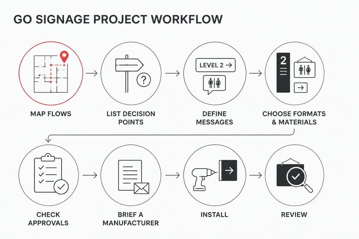
A go signage project runs most smoothly when decisions are made in a fixed order, starting with the movement you want to control rather than the sign you want to buy.
- Map the flows. Walk the site and note where vehicles, pedestrians and deliveries move, and where they conflict.
- List decision points. Mark every junction, gate, door and bay where someone must choose a direction or wait.
- Define the message at each point. Decide whether each location needs go, stop, direct or inform, and write the exact wording.
- Choose formats and materials. Match each location to the right size, finish and level of illumination.
- Check approvals. Confirm with the municipality and, for workplace signs, against your safety file.
- Brief a manufacturer. Provide your site plan, brand guidelines and the list from step three.
- Install and review. Fit the signs, then observe real traffic for a few days and adjust anything that causes hesitation.
Budget is easier to set once the list in step three exists.
Should go signage be part of your branded entrance?
For businesses with a public frontage, the entrance is often the most seen go sign on the property, so it is worth treating it as both a wayfinding tool and a brand asset. A tall, clear marker visible from the road tells drivers where to turn in, and it can carry your logo, tenant names and opening hours in the same structure.
A pylon is the usual format for this job. Bespoke pylon signage from Signs4SA is designed and manufactured to your specification, which suits sites where height, illumination and tenant panels need to be planned together.
Entrance signs perform best when they are read in sequence: a pylon at the road, a directional sign at the gate, and a go or proceed sign at the boom or door. Each should repeat the same colours, lettering and arrow style. Signs4SA's guide to exterior business signage covers how these layers fit together.
Why does professional manufacture and installation matter?
Professional manufacture and installation matter because a go sign that is poorly mounted, faded or fitted at the wrong height fails at the exact moment it is needed. Fixings must suit the wall or post, electrical connections for illuminated signs must be safe, and positioning must match the sightline of the person reading it.
Working with a manufacturer that handles design, production and fitting in-house reduces the handovers where errors creep in. Signs4SA has over 25 years of signage experience and manufactures, supplies and installs in-house, with BEE Level 1 status that some corporate procurement teams require. Its guide to professional signage installation sets out what to expect from a good installation.
Maintenance deserves a place in the plan too. Dirt, fading and damage reduce legibility, so schedule periodic cleaning and inspection, particularly for illuminated and outdoor signs. The signage maintenance tips article offers a practical routine.
Common go signage mistakes to avoid
Most go signage problems come from a short list of avoidable errors:
- Mixed messages. A go sign placed beside an unrelated stop sign leaves drivers unsure which applies.
- Inconsistent styling. Signs bought piecemeal over time use different colours and fonts, which weakens recognition.
- Poor placement. Signs set too far past the decision point, or hidden behind vegetation or parked vehicles, are read too late.
- Undersized lettering. Text that works on a drawing often fails at real driving speeds.
- No review after installation. Small adjustments, such as moving a sign a few metres, can resolve persistent confusion.
- Ignoring local approvals. Signs visible from public roads can attract compliance issues if installed without checking by-laws.
A short post-installation review, ideally covering peak traffic times and the first shift change, catches most of these.
Your next step is to walk your premises, mark every point where people or vehicles must decide whether to proceed, and use that list as the brief for a quote. Signs4SA can turn that brief into manufactured and installed signage, from a pylon sign at your entrance to directional and access signs across the site. To discuss your project and Request a Quote, send your site plan and requirements to the team.